MY ROLE
Product Designer
UX Strategy
Prototype
User Interviews
Usability test
COMPANY
Zello Tech
TEAM
1 Product Manager
1 Tech lead
1 Designer Assistant
1 Dev Front-end
2 Devs Back-end
ABOUT
BRB is a bank in Brasília where most account holders are civil servants. In 2019, a new president was appointed and set new goals to take BRB to another level. One of the biggest pains at that moment was the numerous complaints about the mobile app, and that was my challenge.
CHALLENGE
As a more traditional bank, our first challenge was to convince the board to invest in a new application with design processes and methodologies. However, the biggest pains found in the current app were:
• Low adoption by customers;
• High number of support complaints;
• Instability in services;
• Low conversion when hiring new products through the app.
SOLUTION
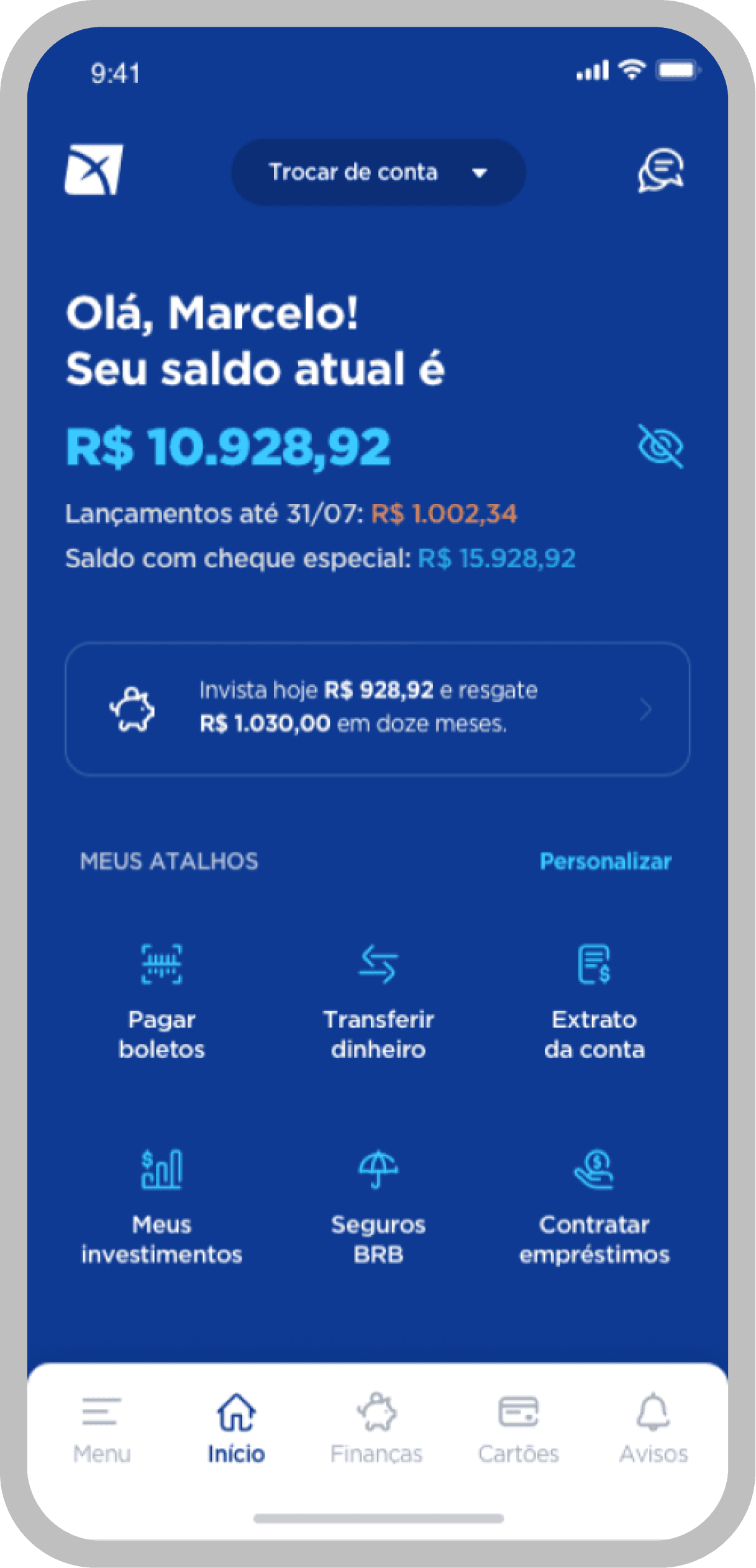
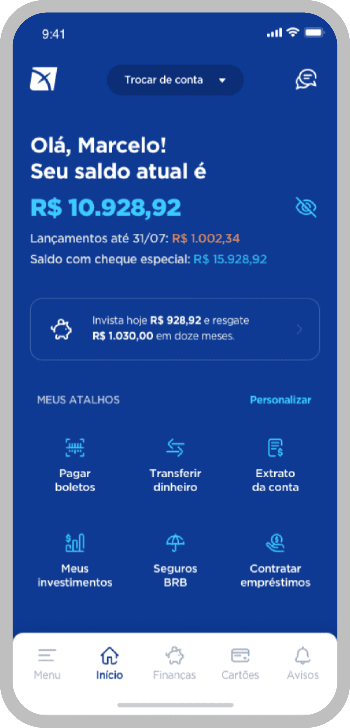
In the discovery phase, we raised some insights that would directly impact the project's KPIs. We decided to create a smart, fast and mostly useful application. So we take initiatives such as:
• Automation of trivial processes;
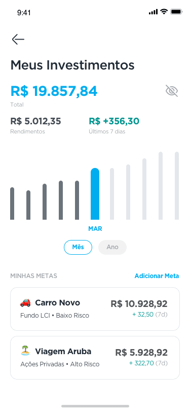
• Offer products and services at strategic moments of the journey;
• Payment of multiple tickets;
• Reformulation of the service infrastructure;
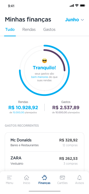
• Financial education functionality;
• Constantly receiving feedback for the evolution of sprints.
RESULTS
Biggest highlight in the 291.5% increase in the customer base.
Considerable increase in contracting products and services in the app.
LEARNINGS
Initially, we started with a very innovative interface, following many references from the fintech industry, but in interviews with users we noticed that some features were very playful and not so obvious. It was at that moment that we took a step back and started with simpler actions, given that 40% of customers were over 60 years old.

